What Nobody Tells You About Shopify Theme Development


February 22, 2016 by Paul Byrne
The release of Magento 2 brought many usability upgrades on both the front-end and back-end of the eCommerce platform. The most noticeable change on the Magento 2 back-end is the new admin panel. The admin panel now sits at the left side of the screen and the all-around look has moved to a flat design. This flat design lends itself to be usable on a tablet, utilizing larger touch/tap points. The navigation bar is also in grey, a high contrast to the lighter workspace area, adding another high-usability feature.

The admin panel is better organized with tasks, such as creating a new product, which one can complete in fewer clicks. This means an easier workflow and improved efficiency when navigating the front-end of your Magento 2 store. The ability to add and remove columns on the front-end allows for swift navigation between products and categories.
The new method of container wrapping in Magento 2 makes it possible for site visitors to interact with the site in new ways that were not possible before, as containers can now contain multiple static blocks and other elements simultaneously. In addition, the front-end now has an improved catalog function, giving users the ability to create attributes from the product creation page and reorganize attributes after the creation of a product.
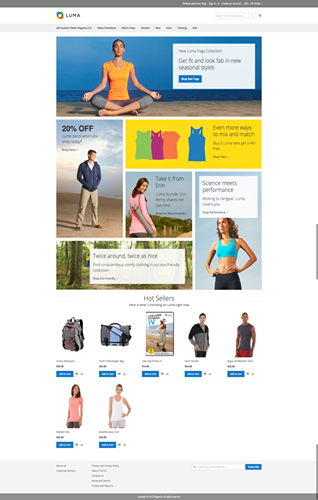
The Default Theme “Luma” is out-of-the-box responsive, which goes to show how Magento is doing everything in its power to stay a leading, cutting-edge eCommerce platform. The default theme also boasts a very design conscious card design. The cards allow for more content to be shown on the home page in a very visually-pleasing manner.

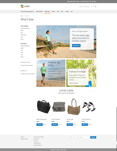
Over on the category page, admins will find the card design featured. This gives users the ability to create a consistent branding experience throughout the website.

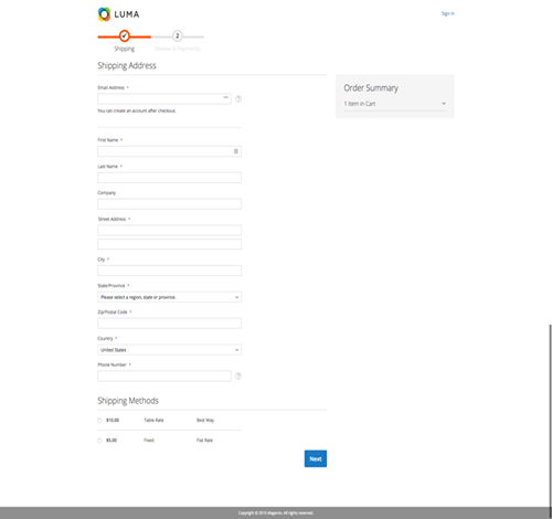
Diving deeper into the website, one will notice larger product pictures. This gives admins the option to show more detailed images. In the cart, a simplified two-step checkout process on the front-end has been added. This allows for swift payment processing.

Magento 2 brings a cleaner front-end design, easier navigation, a touch-ready admin panel, and a new default theme packed with trend-forward design features. Magento 2 is making it easier for merchants to sell online with a powerful product behind them.
These links open AI platforms with pre-written prompts about this page.
We use cookies to improve your experience. Do you accept?
To find out more about the types of cookies, as well as who sends them on our website, please visit our cookie policy and privacy policy.